


Color Palette
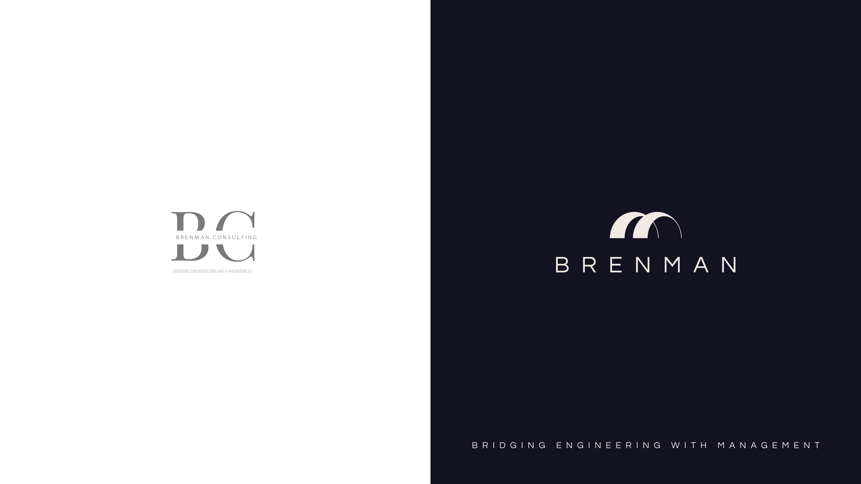
Brenman Consulting sits at the intersection of engineering and management — helping infrastructure projects move from blueprint to reality. Their old identity didn't reflect the scale or ambition of the work they do.
We rebuilt their brand from the ground up. The new identity centres on a triple-arch mark — a direct nod to bridges, structural engineering, and the connections Brenman creates between disciplines. The wordmark is clean, widely spaced, and confident.
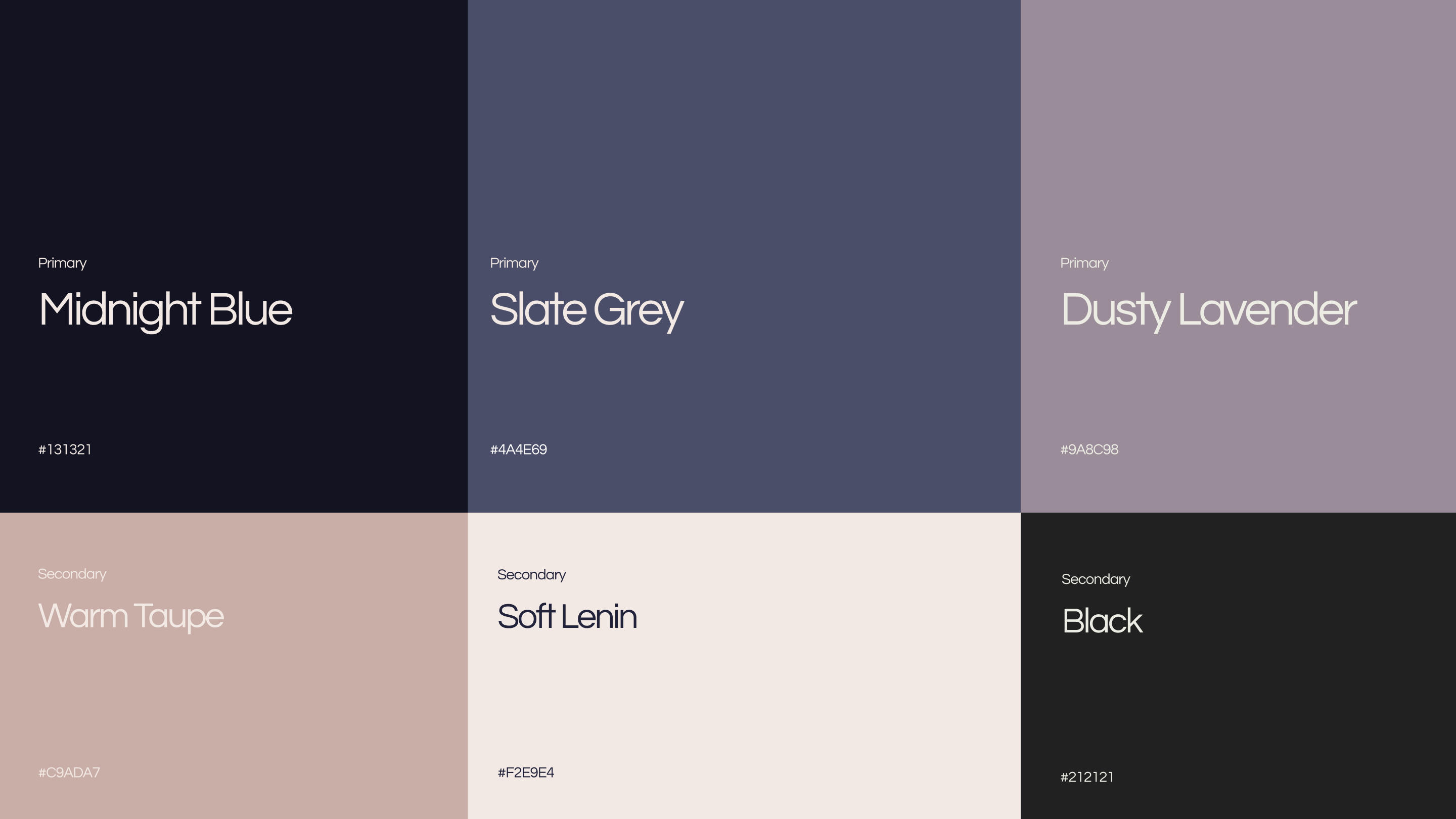
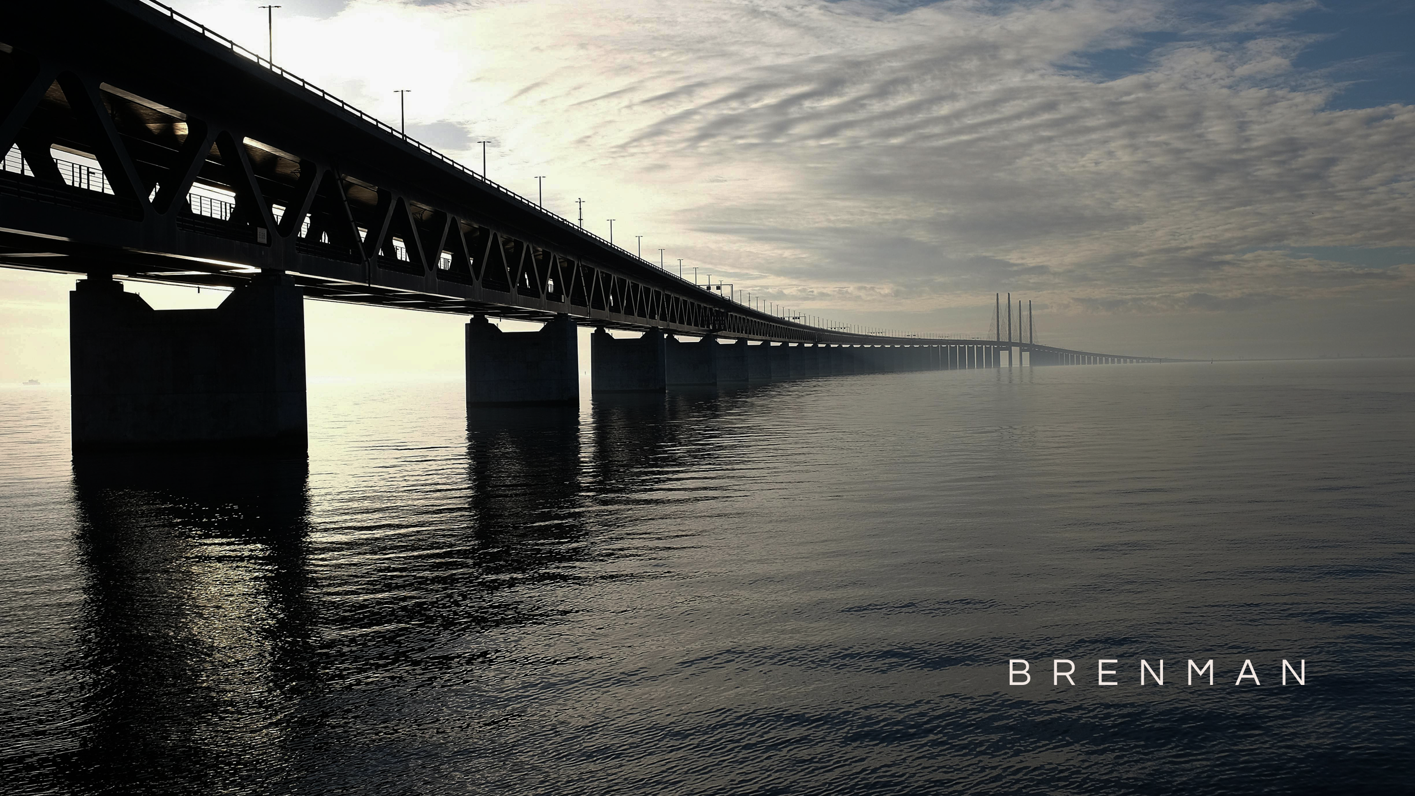
The colour palette is rooted in deep midnight blues and sophisticated neutrals, reflecting precision and authority. Imagery pulls from real-world infrastructure — bridges, construction sites, architectural facades — with the brand mark embedded into each frame, grounding the identity in the physical world it serves.
Deliverables